Create a simple Hamburger menu with CSS only
Let's start with a pretty easy and smart solution. No JavaScript, only CSS.
Confession
The basic idea was not mine. Unfortunately I don’t even remember where I read about if for the first time, so I am unable to place credits, and I also unable to tell which solution was the one that give the base for my code. There are tons of tutorials in this topic believe me. And now here’s mine.
TL;DR
If you don’t want to waste your time reading this tutorial, and you only need a working code sample, please check the source code on GitHub.
Build my Burger up!
The goal is to create a slide-in menu with semi-transparent, clickable backdrop without any JavaScript, image or font resources. Only HTML and CSS. It sounds easy, and after we have done it for the first time, we will see that, it IS really easy to understand and adopt this technique to other use cases.
Naming conventions
There are many popular standards and recommendations on the market which should be considered before starting the development. I prefer the ABEM, but please feel free to use any other you like. The code samples will be straightforward and easy to replace the class names.
1. Wrapper
I tried some “wrapper-less” solutions during the development process, but none of them could satisfy my criteria. We NEED a wrapper. Anyways I like boxing and encapsulating.
1


                <div class="m-menu"></div>
2. Hamburger
I’m starving for a (good) hamburger, and I am not (yet enough) afraid of the junk food giants. But forget about the food for a minute,
because what we are talking about now is that three little piggies horizontal bars on the top left corner on this site (and on many
others). This symbol became a standard in the last decade, so again:
No need to reinvent the wheel.
There are (at least) three ways to create this icon:
- Use an image. By itself, or as a background, doesn’t matter. A bit old thinking, but definitely the easiest.
- Use an Icon Font (like the Material Icons). Elegant and popular solution.
- Use meaningless markup and style them with CSS.
I used the third option, because I promised a “CSS-only Hamburger Menu”, and not a “CSS-only Hamburger Menu with Image, Font and Cheese”. So let’s create those meaningless markups:
1
2
3
4
5


    <div class="m-menu">
    <div class="m-menu__burger">
        <span></span>
    </div>
</div>
3. Toggle state
Then, we have to be able to define two states: Open and Closed. Without JavaScript our toolkit is very limited when we
are talking about ‘state’. No doubt, the best tool for this job is the checkbox. This HTML element natively provides us what we
need, and we don’t have to deal with any JavaScript to change its state. And most importantly: we can differentiate these states
on CSS level.
1
2
3
4


    <div class="m-menu">
    ...
    <input class="m-menu__toggle" type="checkbox">
</div>
4. Menu body
And of course we need the menu body itself and some content to make it useful:
1
2
3
4
5
6
7
8
9
10
11
12
13


    <div class="m-menu">
    ...
    <div class="m-menu__content">
        <nav>
            <h2>Categories</h2>
            <ul>
                <li><a href="index.html">Cars</a></li>
                <li><a href="index.html">Girls</a></li>
                <li><a href="index.html">Money</a></li>
            </ul>
        </nav>
    </div>
</div>
5. Backdrop
Unfortunately the ::backdrop CSS pseudo-element
is not supported in every modern browser… ☞ Safari! Hello?? …so we have do a little bit of workaround.
1
2
3
4


    <div class="m-menu">
    ...
    <div class="m-menu__backdrop"></div>
</div>
Now, that we have the menu skeleton, it’s time to add the style that makes all the magic.
Pimp my Burger up!
To be able to do the CSS job in the right way, I like to visualize the layers and boxes in my head. We need to know which element will
be over the other. Until the W3C is not ready with the Mind Reader API, I use this simple diagram:
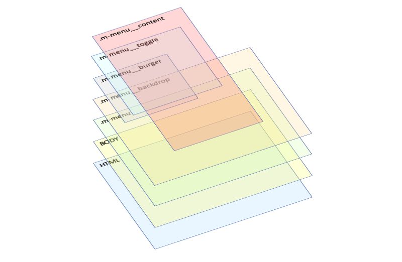
The actual page content will be between the BODY and the .m-menu wrapper.
Recommendation
There are some default styles I used to set up every time, to be able to calculate better with box sizes. If you don’t want to use any of the popular CSS “Frameworks”, I highly recommend you to use these setting as well. I believe they will make your life much easier.
1
2
3
4
5
6
7
8
9
10
11
12
13
14
15
16
17
18
19
20
21
22
23
24
25
26


    *, *::before, *::after {
    box-sizing: border-box;
    position: relative;
    cursor: default;
    margin: 0;
}

html {
    position: relative;
    margin: 0;
    padding: 0;
    width: 100vw;
    height: 100vh;
    font-size: 62.5%;
}

body {
    margin: 0;
    padding: 0;
    width: 100vw;
    height: 100vh;
    font-variant-ligatures: no-common-ligatures;
    font-feature-settings: "kern", "liga" 0, "clig" 0;
    scroll-behavior: smooth;
    overflow-x: hidden;
}
Explanation
box-sizing: border-box;-
Applied on every element and on the
beforeandafterpseudo-element. Helps calculating with the box sizes and positions. cursor: default;- It's my personal preference, but I don't like the default cursor over the text. Sometimes it's really hard to find, where you left it.
font-size: 62.5%;-
Applied on the HTML element. If your browser supports the unspoken rules, then this should set the base size to 10 pixels. And
later on you can simply use the
remunit instead ofpx. Why? Because if the user decides to change the browser's default font sizing, the design will automatically scale properly and the design will not break apart. orverflow-x: hidden;-
We stretch the HTML, the BODY and also our menu wrapper to the maximum width of the browsing area. In general it's fine, but on
Windows the scrollbars are those old-fashioned ones that consumes a narrow area (around 20 pixels) from this browsing area instead
of being an overlay like on Mac OSX and on some Linux Distros (e.g.: Ubuntu). So when we have a long content, the vertical scrollbar
appears, takes 20 pixels from the browsing area, and since our HTML is said to be
100vw, the whole thing together will be100vw + 20px, which is wider than it can display, so the horizontal scrollbar will appear too. That is what we try to avoid. Of course you have to keep this in mind, and plan your design well to let enough space for the scrollbar.
1. The wrapper
We put the wrapper into the top left corner and stretch it over the whole browser window and also stuck it into that position whatever happens.
1
2
3
4
5
6
7
8
9
10
11


    .m-menu {
  position: fixed;
  top: 0;
  left: 0;
  width: 100vw;
  height: 100vh;
  z-index: 100;
  pointer-events: none;
  margin: 0;
  padding: 0;
}
See that we use the vw (viewport width) and vh (viewport height) instead of a percentage value. Why? In nutshell, a very non
precisely answer is, we use it because the percentage will be calculated from the parent element, while the viewport is calculated
from the browser window area size. And together with the position: fixed it will be always in the same viewport position even if we
scroll the content “below”. Yes, they are below, because this wrapper should be always on top. For this make sure that the
z-index’s value is high enough.
But if it’s on the top it will block the underneath content!
No, and here’s the little magic, I was talking about. The pointer-events: none; will make sure that this element will let every
pointer (mouse) events through to the elements underneath.
2. The backdrop
The first layer inside the wrapper - counting from bottom to top - is the backdrop. What the backdrop is about? According to the definition, it…
is a box the size of the viewport which is rendered immediately beneath any element being presented in full-screen mode. This includes both elements which have been placed in full-screen mode using the Fullscreen API and
Cool. Unfortunately this definition belongs to the ::backdrop CSS pseudo-element, which is not supported, so we have to make it work with a bit
of thinking.
1
2
3
4
5
6
7
8
9
10
11
12


    .m-menu__backdrop {
  z-index: 1;
  position: fixed;
  top: 0;
  left: 0;
  width: 100%;
  height: 100%;
  background-color: rgba(0, 0, 0, 0.5);
  opacity: 0;
  transition: opacity 500ms ease-out;
  pointer-events: none;
}
Yet another full-streched element. However here we used percentage instead of viewport units. Remember what I wrote about the difference between these units? We defined the must have size of the whole menu for the wrapper. Each children will reflect to this, so the percentage is just fine.
We defined here some contradictory things, like setting semi-transparent background-color when also set the
opacity to zero. Why? We define everything that it should have when it will be fully visible, but the initial state is to not show it. Other styles
like display: none, or visibility: hidden, or positioning out of the scope are not suitable, because for the fade-in effect those are simply not
good. And we want fancy eye-candy for our menu, don’t we?
See that we also ignore the click event on it. That is by purpose, our workaround solution doesn’t need to be clicked.
For now let it rest a bit, and continue with the rest of the menu.
3. The burger
The next layer is the Hamburger icon which technically is only a visual thing.
Within the wrapper we can bravely position the elements with the absolute value too.
1
2
3
4
5
6
7
8
9


    .m-menu__burger {
  z-index: 2;
  position: absolute;
  width: 4rem;
  height: 4rem;
  top: 1.1rem;
  left: 1.1rem;
  padding: 0.6rem 0.4rem;
}
This will position the hamburger icon box 11px from the top left corner. This is only the container for the bars which are created from one single
span element the good old ::before and ::after pseudo-elements.
1
2
3
4
5
6
7
8
9
10
11
12
13
14
15
16
17
18
19
20


    .m-menu__burger span,
.m-menu__burger span::before,
.m-menu__burger span::after {
    content: '';
    display: block;
    width: 3.2rem;
    height: 0.4rem;
    position: absolute;
    margin-top: 1.2rem;
    background: rgba(255, 255, 255, 1);
    border-radius: 0.3rem;
}

.m-menu__burger span::before {
    margin-top: -0.8rem;
}

.m-menu__burger span::after {
    margin-top: 0.8rem;
}
Explanation
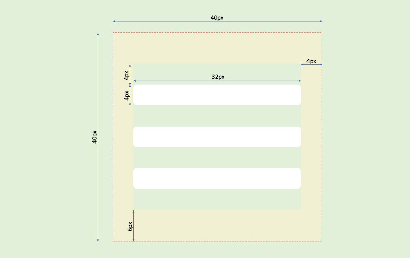
So basically we set to hamburger container to 40px ✕ 40px with thick padding (two times 4px on the sides and two times 6px on top and bottom),
that will reduce the inner area 32px ✕ 28px. This will be our sandbox. The 32px width is exactly the with of the horizontal lines (the layers
of the hamburger), and the 28px is also perfect, because it’s an easy to count value when we divide it with 7.
Why seven? Because it’s easy to count with: three of them are the bars themselves - so the height of one bar is 4px -, and four are the gaps
around them (also 4px). Since the pseudo-elements belong to the “parent” and they move together, we have to calculate a little bit weird way:
- position the
spanto the middle: gap +::before+ gap, which is3 ✕ 4px, so set themargin-topto12px. - position the
::beforeabove the span: position of thespanas root - gap - height of the::before, which is0 - 4px - 4px, so set themargin-topto-8px. - position the
::afterunder the span: position of thespanas root + the height of thespan+ gap, which is0 + 4px + px, so set themargin-topto8px
The measuring looks something like this on the picture:
4. The toggle
The next layer is the toggle, the heart of the menu controlling. Remember, it’s a checkbox element, that should be clickable, but not really visible.
So we do the following:
1
2
3
4
5
6
7
8
9
10
11
12


    .m-menu__toggle {
  z-index: 3;
  position: absolute;
  width: 4rem;
  height: 4rem;
  top: 1.1rem;
  left: 1.1rem;
  cursor: pointer;
  opacity: 0;
  outline: 1px solid black;
  pointer-events: all;
}
See that the size and position in the initial state is the same as the hamburger’s, and positioned right above it. Yes, the trick is you can change the
size of a checkbox. If you make it visible by setting the opacity to 1, you can see how weird it looks like. In fact in every browser it will look a
bit different. But we don’t want to so it, we need it only to be functional. Luckily it will be, even after change it’s default size.
And of course we have to make the hamburger clickable, so we set the pointer-events: all.
5. The menu
The topmost layer is the menu content. It’s up to you how you design it, I prefer to make it similar to the one that the Material Design Lite uses. For this tutorial I focus on the menu “frame” only.
1
2
3
4
5
6
7
8
9
10
11
12
13
14
15
16
17


    .m-menu__content {
  z-index: 4;
  position: absolute;
  top: 0;
  left: 0;
  overflow: auto;
  width: 30rem;
  height: 100vh;
  margin: 0;
  padding: 0 0 2rem 0;
  background: rgba(230, 230, 230, 1);
  transform-origin: 0 0;
  transform: translateX(-31.5rem);
  transition: transform 0.5s cubic-bezier(0.77,0.2,0.05,1.0);
  pointer-events: all;
  box-shadow: 0 0 1rem 0 rgba(0, 0, 0, 0.75);
}
Explanation
We defined a fixed 300px width and stretched it vertically. By setting the overflow: auto, we make sure to support the menus with many entries and
also make it work on small screens, like smart phones. We also enabled all pointer-events, because we want to make the menu items to be clickable.
Remember you have to do this only within the wrapper.
We also added a little drop shadow just to visually highlight the menu. You can also see that we moved out the menu from the scope to the left with
the size of 315px. How we get this number? It’s the width of the menu (300px), the spread of the shadow (10px) and a little bit of safety margin
(5px).
And don’t think that I am a Math genius, the cubic-bezier transition was fine-tuned with the Google Chrome’s Dev Tools.
6. Changing state
Now we have the menu’s initial style ready. But how will it work? Let’s define the workflow:
- Initial / Closed state: the hamburger icon is clickable, the rest of the page is not blocked by the wrapper
- Click on the hamburger
- The menu slides in and the backdrop fades in. ☞ Open state.
- Open state: the menu is visible, the menu items are individually clickable. The backdrop blocks the website “under” it, and the full backdrop is clickable.
- Click on the menu items will load the targeted address, click on the backdrop will slide out the menu and fades out the backdrop. ☞ Closed state.
This behavior can be defined in three little rules which will be applied only when the checkbox is checked. For this we have to use the :checked
pseudo-class selector which is widely supported.
1
2
3
4
5
6
7


    .m-menu__toggle:checked {
  top: 0;
  left: 0;
  width: 100%;
  height: 100%;
  margin: 0;
}
When the unvisible checkbox is clicked, it will get the checked property set by the browser, and with the :checked pseudo-class selector we can
apply additional styles. Here we make it stretched to 100% in both directions. Why we use percent instead of the vw and vh units? Because of the
same reason we used it for the backdrop.
1
2
3


    .m-menu__toggle:checked ~ .m-menu__content {
  transform: none;
}
Here when the checkbox is checked the .m-menu__content will drop its transform style, which was translateX(-31.5rem);. In this case the none is
equal with setting it to translateX(0); but in a shorter way. The transition will add some dynamics into the slide-in.
1
2
3


    .m-menu__toggle:checked ~ .m-menu__backdrop {
  opacity: 1;
}
Setting the backdrops’s opacity to 1 will make it appear with a transition effect that we defined in the backdrop’s initial state. And since we
did it there, it will also “played” backwards when we get back to that state.
Live Demo
I drop together a little demo, check it out on CodePen.
Conclusion
Creating something spectacular is not that difficult if we use our imagination and practice a little bit. Even this tutorial is very very easy, and I still could optimize it’s structure a little bit while I was writing this article. It’s all about learn, practice and learn again. And don’t be afraid to leave the comfort zone of the various frameworks.
Is this a good practice or a worst practice? Please tell me.